Mixing metrics on analysis graph
 kevriley
Posts: 129 Gold 1
kevriley
Posts: 129 Gold 1
When showing more than one metric on a graph on the Analysis page, I fully understand that it is difficult to merge the units scales on the x axis. So what you get is each graph has it's 'own' x axis - and I get that - it makes sense when the units are incompatible (eg. percentage vs KB used vs batch/sec).
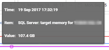
But when all the metrics are measure in the same units, it can create a visually confusing graph. In this example I'm looking at memory usage over time, so I've chosen Machine: memory used, SQL Server: total memory, SQL Server: target memory. On the face of it, it looks like SQL Server is using way more than target memory, and in fact more than the entire machine is using!! Only when you mouse over the graph and get the values do you see that the total memory is in fact just under target memory and fairly well below machine memory.


So I'd like it if the graph was more intelligent about this, and shared the x axis when it could. Not sure how you can handle this if there are a mixture of compatible and non-compatible metrics, but you've got some good UXers there who can bash this around!
But when all the metrics are measure in the same units, it can create a visually confusing graph. In this example I'm looking at memory usage over time, so I've chosen Machine: memory used, SQL Server: total memory, SQL Server: target memory. On the face of it, it looks like SQL Server is using way more than target memory, and in fact more than the entire machine is using!! Only when you mouse over the graph and get the values do you see that the total memory is in fact just under target memory and fairly well below machine memory.
So I'd like it if the graph was more intelligent about this, and shared the x axis when it could. Not sure how you can handle this if there are a mixture of compatible and non-compatible metrics, but you've got some good UXers there who can bash this around!
Tagged:


Comments
I've raised this with the team previously as I had a very similar experience when the units are the same so the team are aware of it. It couldn't hurt to raise a Uservoice suggestion for it as well and I've brought it up again referencing this post too
Kind regards,
Alex
Have you visited our Help Center?
https://sqlmonitor.uservoice.com/forums/91743-suggestions/suggestions/31648318-support-for-showing-multiple-metrics-with-the-same
Vote it up!
Riley Waterhouse Limited
Twitter: @kevriley